


the problem❓
Busy professionals have no time to visit medicine store
Ordering of medicines with confusing interface can be a hectic process for busy working professionals during work time.

It requires a lot of time and effort for the users to visit nearby medicine store during pandemic. Standing in queue to buy medicines is a frustrating process for patients.
Need of an app with simple user interface to help people buy medicines online and deliver medicines at their doorstep.
Ordering of medicines with confusing interface can be a hectic process for busy working professionals during work time.
To start understanding the big picture and the problem, I examined the big players in the market as well as parallel markets: Netmeds, Medlife, Pharmeasy, 1 mg and more. I read the user reviews of the various products, and joined
online groups to understand more about the users.

To improve the product delivery concern, speed delivery to all the locations with delivery button will be provided at the main page of the app.

To ensure the happy path for returning customers, discounts on the products will be provided in a separate screen for the returning customers. Also, delivering right product to the customers will be assured.

To uphold the customer satisfaction, contact numbers and details will be added to make improvements in customer support.
To understand the pain points I interviewed 4 busy working professionals who are in a need of an uncomplicated app.

Users stated that it is important for them to use a easy and simple app to order medicines. Most of the apps out in market have unnecessary popup ads, complicated app interaction. So a clear call to action button will be added in the homepage to order medicine without any difficulties.

Users noted they sometimes search for a specific brand product to order from the app. So we will add a separate section to filter products according to the brand and keep an eye on expired products.

Users are busy to search medicines repeatedly to order. So previously ordered medicines can be viewed in a screen where users can reorder directly.
Value for user's time, effortless process and instant delivery.
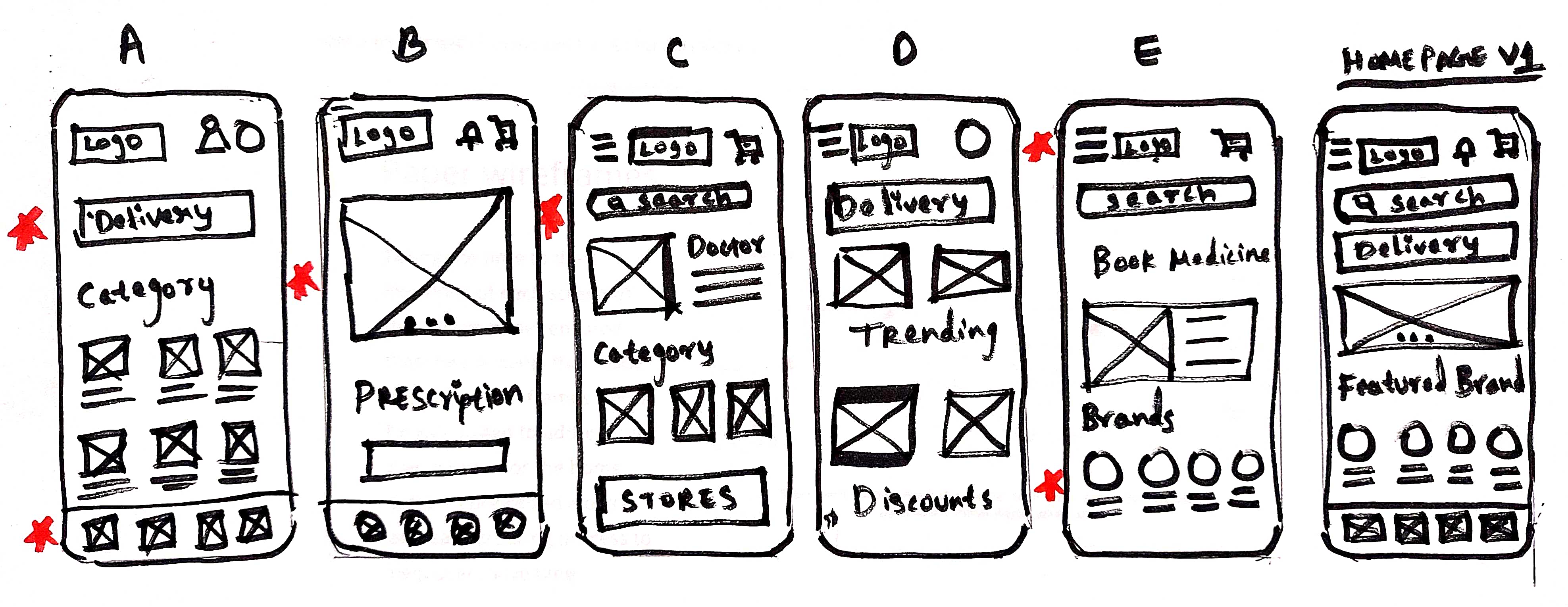

After the flows were ready I made a basic prototype and asked users to perform a number of tasks. Then I could see where they were having difficulty and where I should improve the product based on real use.

Before and After the test
Users wanted another confirmation page to review the orders before checkout while using the app.
☝️
I noticed that users are happy to easily complete the orders that are present in cart section.
✌️
I also saw that users find a big scope for e-pharma app with few changes.
When I examined the problem I actually discovered that there was more than one problem in this flow. In such a simple test I was able to significantly facilitate the user. Adding a confirmation page allowed user to look into details more easily and also removed the doubt about the product, which eased the user overload and shortened the checkout time.
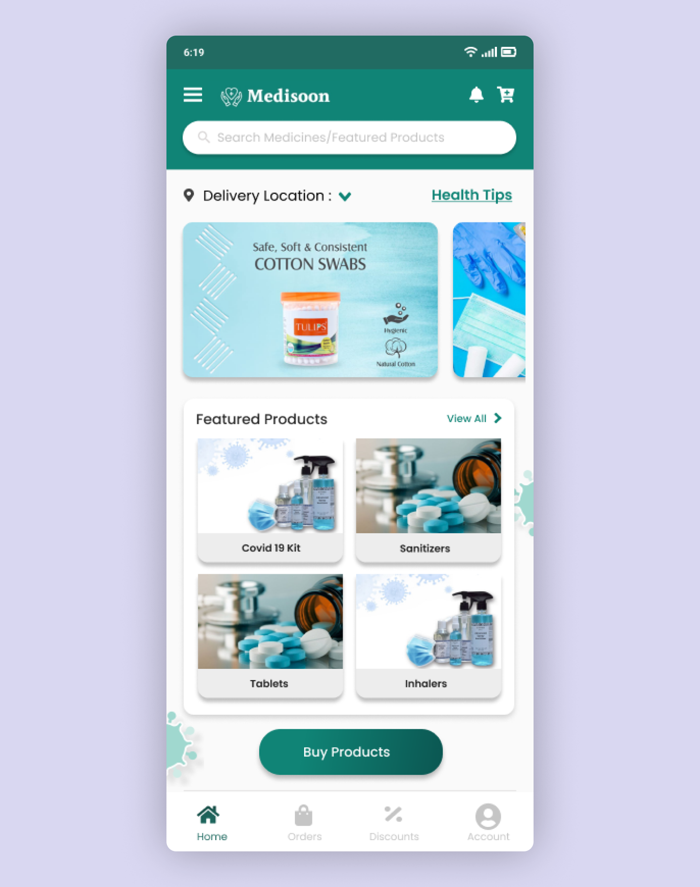
After the user has logged in to the app forwards him to view Homepage that includes products and a Call to action button.

All the details that was entered during the ordering process will be displayed on the Order confirmation page.

To have a quick view of user details that can be editable, navigation to different screens within the app My account section is useful.

Users will get daily health tips based their preference in the screen.

